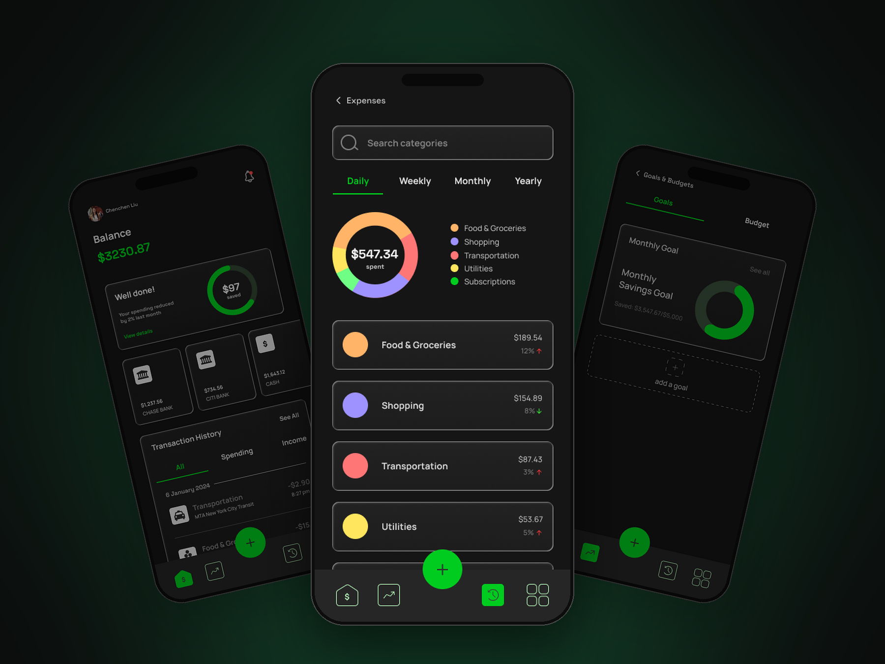
A digital finance tracking app designed to help users take control of their money by making budgeting and saving feel intuitive, visual, and emotionally engaging.
This case study outlines the end-to-end UX process I followed to design Finwise, with a focus on thoughtful decision-making, scalable design systems, and clear data visualization tailored for non-expert users.
Many are juggling multiple expenses, irregular incomes, or debt, and existing apps don't help: they're either overly complex, uninspiring, or fail to connect emotionally with people who need support and motivation alongside the numbers.
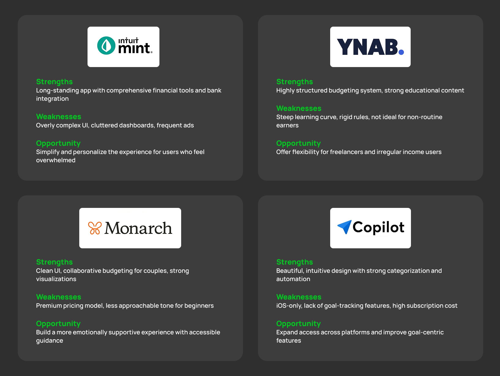
To ground the design in real user needs, I spoke with peers about their spending and saving habits and studied how existing finance apps handle similar problems, looking for what caused frustration, and what actually motivated people to keep going.
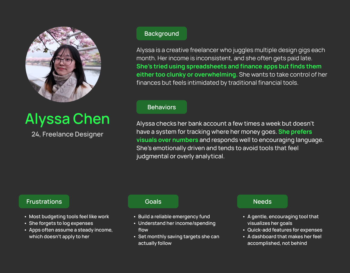
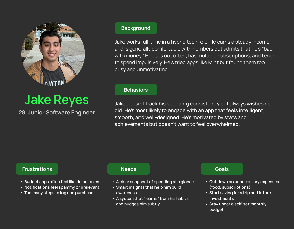
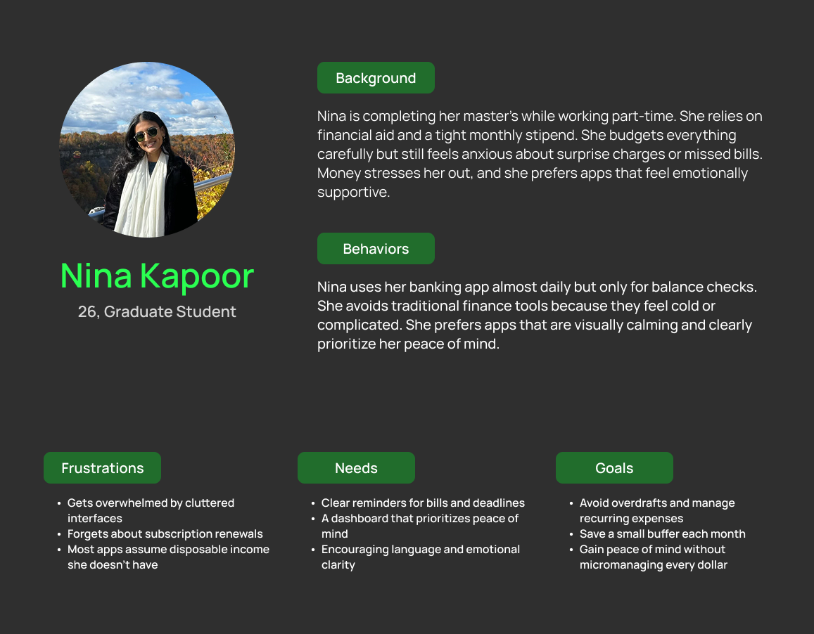
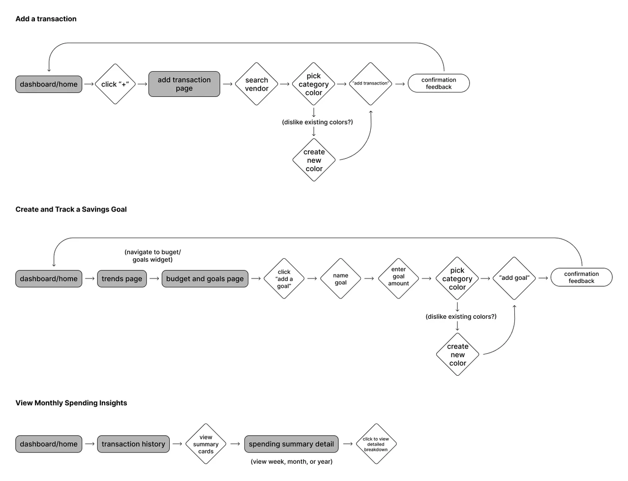
The architecture was intentionally kept simple, prioritizing the tasks users needed to complete most and reducing friction and mental load wherever possible.
Based on research, I defined 3 core user flows:
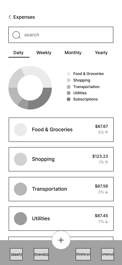
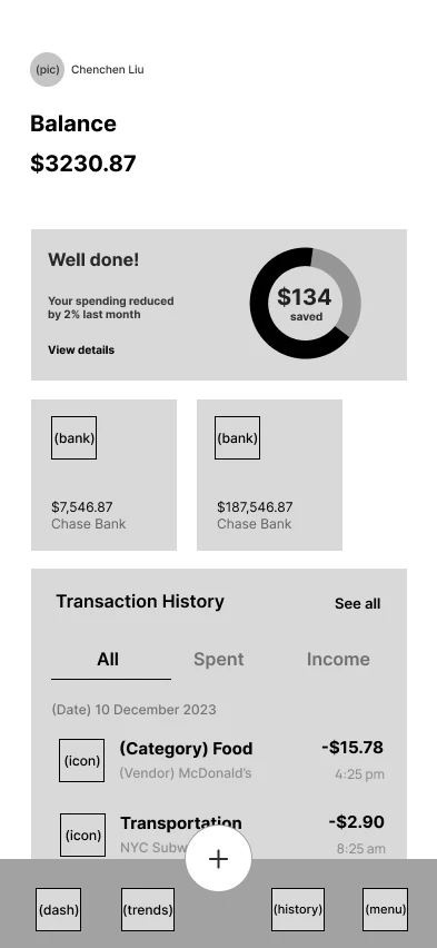
I began with grayscale wireframes to define structure and hierarchy, then moved to high-fidelity designs to apply the system, refine visuals, and guide attention through color and type.
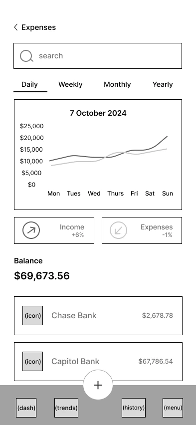
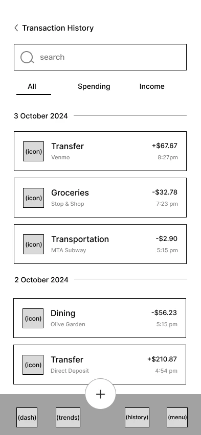
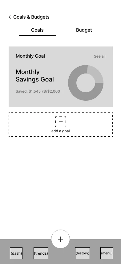
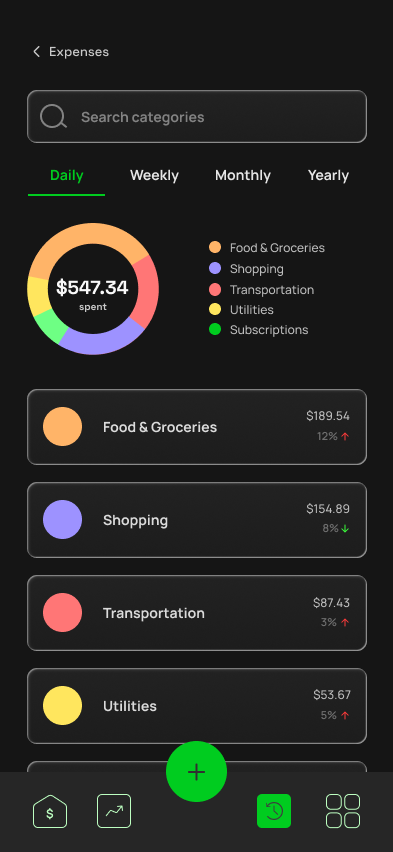
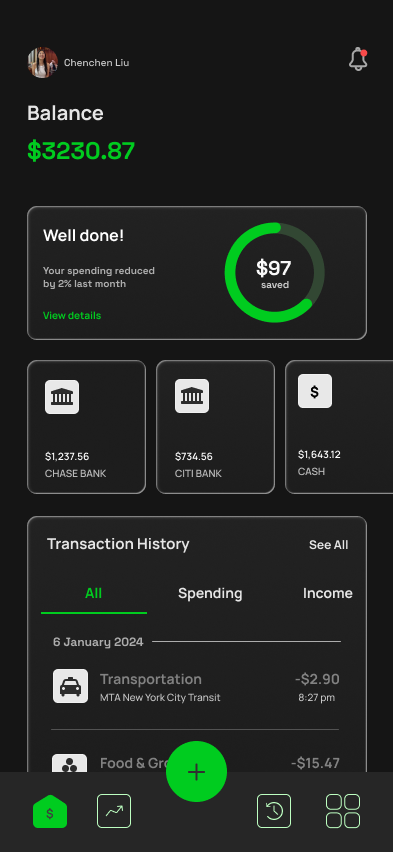
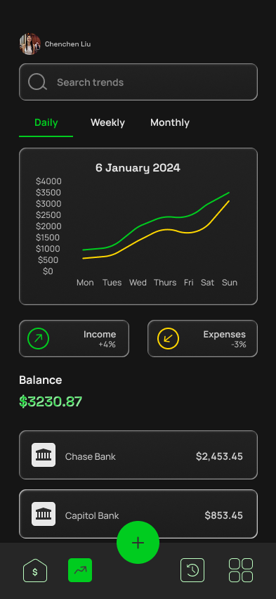
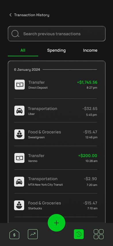
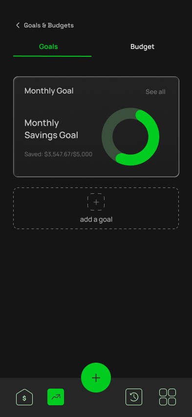
I built a lightweight component library, including color tokens, type scale, spacing, and reusable cards, so the product could grow without visual drift. A dark, high-contrast palette with a signature green accent keeps financial data legible while feeling calm rather than alarming.
View the brand guideHere's a closer look at the five core flows that bring this experience to life.
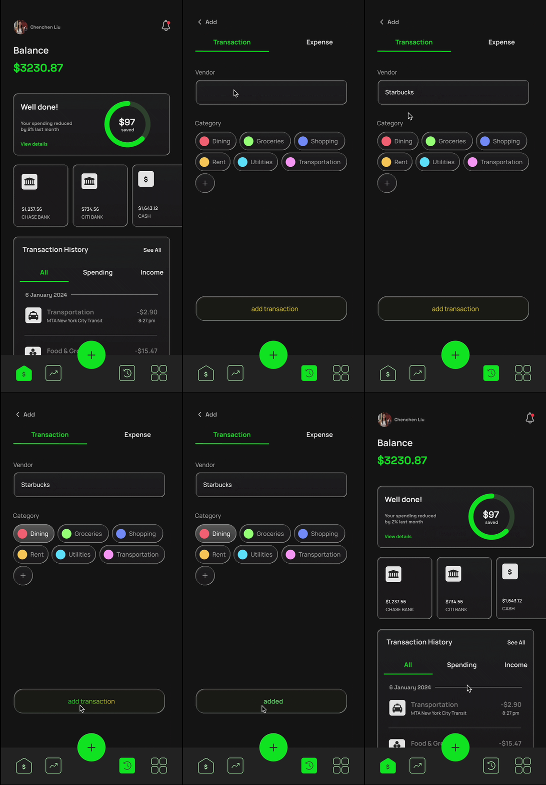
Manually logging expenses shouldn't feel like a chore.
I simplified the flow with category suggestions and a clean layout that lets users enter a transaction in seconds. This keeps the experience fast, intuitive, and easy to build into a daily routine.
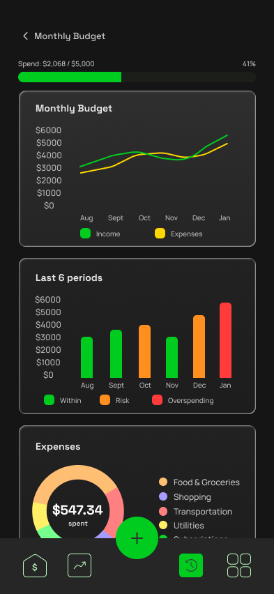
Raw numbers don't help users understand their habits.
I designed a visual insights dashboard with summary cards, interactive charts, and semantic colors to highlight trends and problem areas. Users can view spending by category, time period, or compare past months.
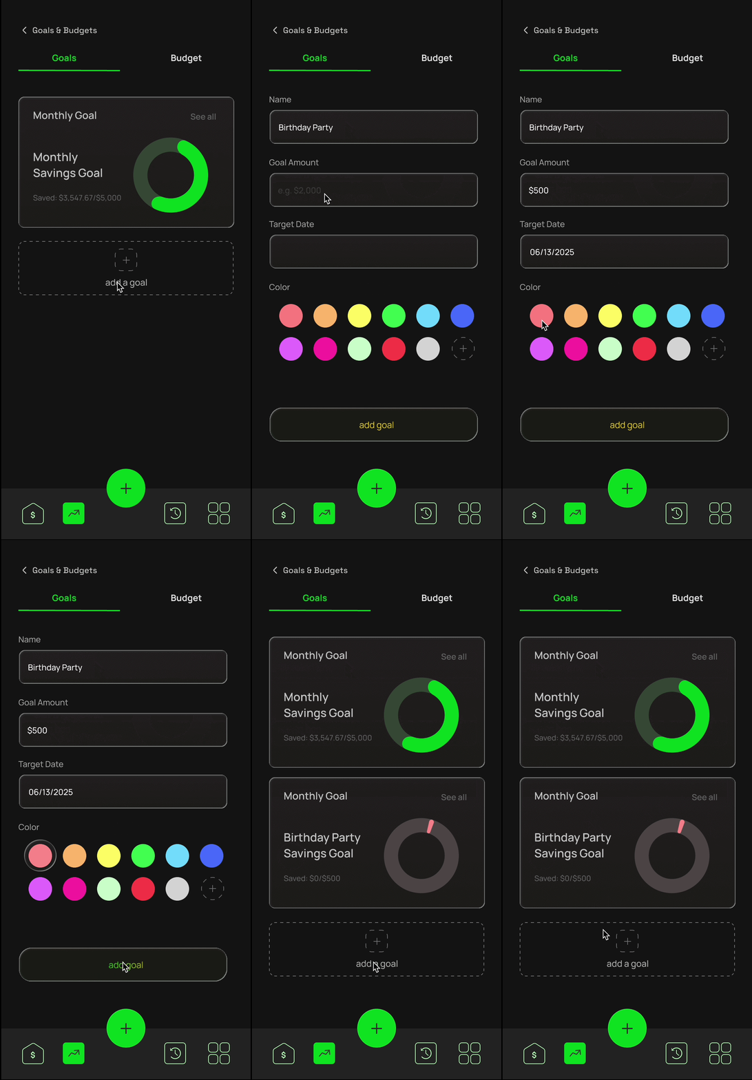
Saving money can feel abstract without visual motivation.
I designed a lightweight flow where users set a goal name, amount, and deadline, then personalize it with a color. A preview card and progress bar make the goal feel real and within reach.
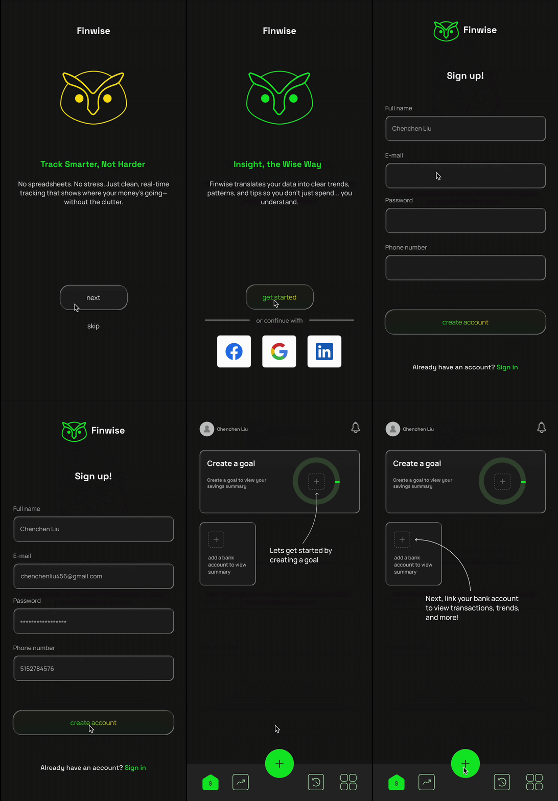
Most users hesitate to trust new finance apps with sensitive data.
I designed an onboarding flow that builds trust early by starting with a secure linking screen, followed by a clear preview of how synced data powers smart insights.
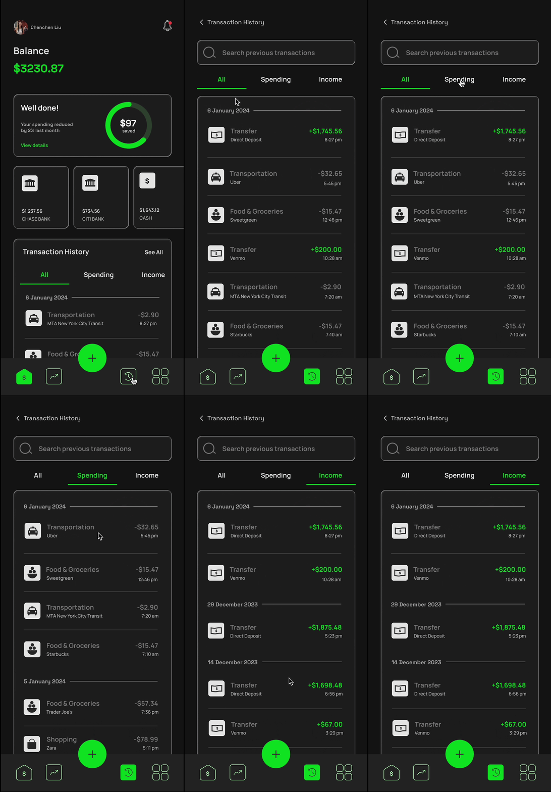
It's easy to lose track of past spending without a clear history view.
I created a dedicated transaction history tab with 3 different views. Each item is easy to scan and editable with a single tap.
Users felt the app was easy to use, clear, and more engaging than what they normally rely on. A few suggestions came up too, which gave me helpful ideas for future improvements.
A few opportunities stood out, like adding reminders, recurring expense tracking, and subscription alerts, which I plan to explore in future iterations to better support real user needs.
To build on this, I created microinteractions in Figma to enhance clarity and feedback during key actions. I also designed a responsive web mockup to show how Finwise could scale across devices.
It also deepened my understanding of emotional UX. I learned that successful financial design is as much about empathy and encouragement as it is about numbers.
I created not just an interface, but a supportive experience. Through modular design, strategic feedback loops, and visual storytelling, Finwise empowers users to feel confident in their financial journey.
If expanded, I would explore: