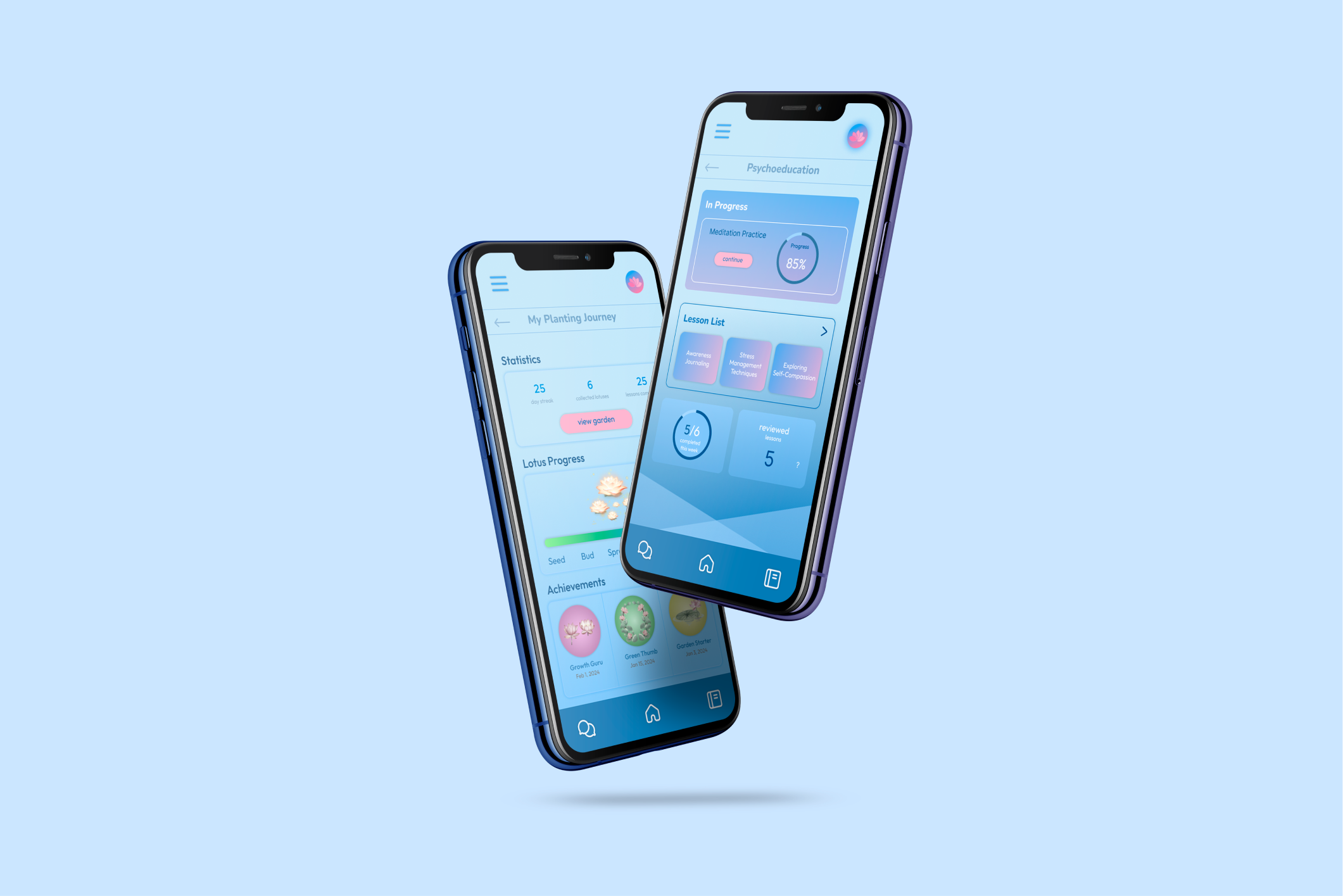
A psychoeducation and community-support app built with Engage You(th) to help Asian American adolescents build lasting mental wellness habits.
Lotus You(th) is a platform by Engage You(th), dedicated to providing mental well-being support to Asian American adolescents through psychoeducation lessons, community support, and weekly goal-setting.
I led the design and research strategy for the overall app and focused on the layout of the psychoeducation features, using strategy frameworks, defining key actions, and shipping a polished design.
While many mental health apps exist, few focus on a specific population. Users also struggle with consistency, making it essential, especially for a nonprofit, to prioritize engagement and align with our broader mission of promoting lasting behavioral change.
I collaborated with a small team to streamline the navigation flow and design an engaging learning experience that promotes better learning outcomes for Asian American adolescents.
We first researched whether psychoeducation actually works: only 7% of youth receive appropriate mental health treatment, and many avoid one-on-one therapy as a first step, while group psychoeducation and digital platforms offer a far more approachable entry point.
To validate that locally, I interviewed 15 Asian Americans from diverse backgrounds. Most were familiar with digital mental health resources, but two-thirds said they weren't comfortable asking for support and didn't want one-on-one sessions with a professional. Access wasn't the barrier; comfort was, which is what pointed the design toward psychoeducation and community support instead of therapy-style, one-on-one interactions.
I analyzed 4 competitors, from in-person therapy to apps like BetterHelp, Togetherall, and Happify, to find where Lotus You(th) could differentiate. Across the board, real engagement and real affordability rarely showed up in the same product.
| Competitor | Strength | Weakness |
|---|---|---|
| In-person clinical therapy | 1:1 conversation, safe to share and receive ongoing support | Not accessible or convenient, lack of quality staff, high cost |
| BetterHelp | Convenient and quick, professional staff, 1:1 therapy sessions available | High cost and long-term investment |
| Togetherall | Credible and safe space for community sharing, builds empathy for peers | Only free and accessible for partnered schools and organizations |
| Happify | Verified tools for mental wellness practice, engaging resources and behavior-change practices | Not accessible to youth due to price, content not customized for youth concerns |
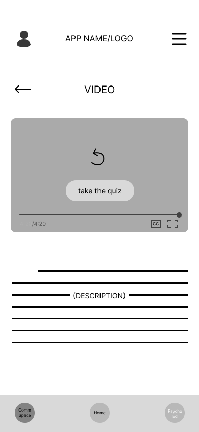
I brainstormed the necessary pages with the team and mapped the information architecture for an app aimed at Asian American youth (15–24 y/o), covering five flows: entrance, onboarding, interactive learning, progress visualization, and community interaction. Wireframes for each flow became the foundation the hi-fi designs would build on.
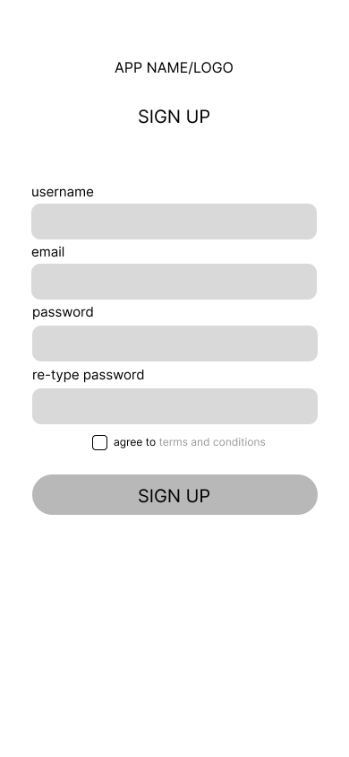
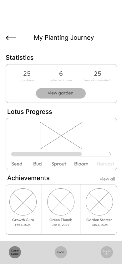
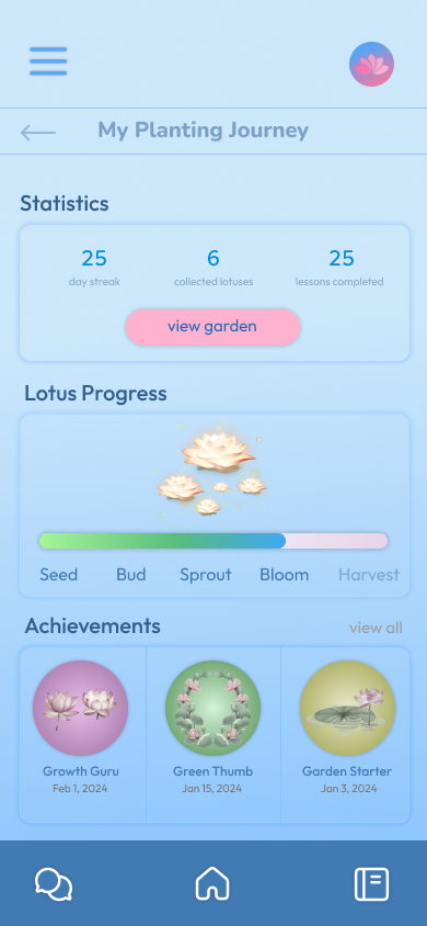
The original wireframe for "My Planting Journey" (the progress page) didn't do a great job of visualizing progress. I continued iterating with the design team to emphasize numeric metrics, progress, and badges. After rounds of iterations and improvements, I could watch my own thought process transform through the mockups.
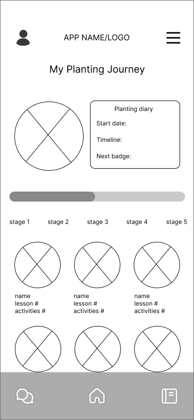
Generic circles for each stage, a start date / timeline field, and a single progress bar: no visual language yet for badges or metrics.

Introduced color and a lotus motif, but lacked visual hierarchy in displaying stats: the planting diary, progress bar, and garden badges all competed for attention equally.
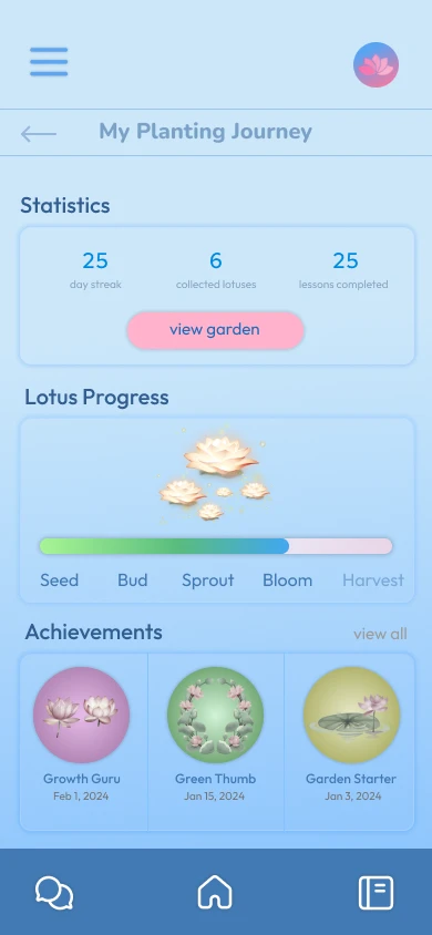
Allowed for visual skimming: a dedicated Statistics row up top (streak, lotuses collected, lessons completed), a labeled Lotus Progress bar, and an Achievements row of earned badges.
We tested with 25 participants through a mix of multiple-choice and open-ended questions, each given about 10 minutes to explore the app independently. The response was strong, but one signal stood out: the original design didn't account for the cultural pressure Asian Americans are often under to succeed. When they fall short, that pressure often turns into shame and guilt, the opposite of what a mental wellness app should produce.
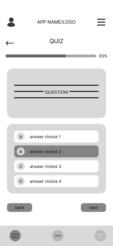
As a designer, it's important to recognize the context of my designs, so based on that feedback, we updated the quiz results page to omit the percentage rating entirely.
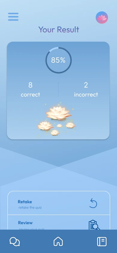
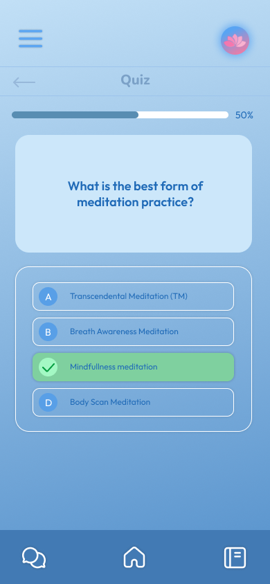
Mental health is a sensitive topic; testing revealed that percentage scores (an 85% circular score plus a correct/incorrect count) may act as a trigger point and cause shame and guilt.
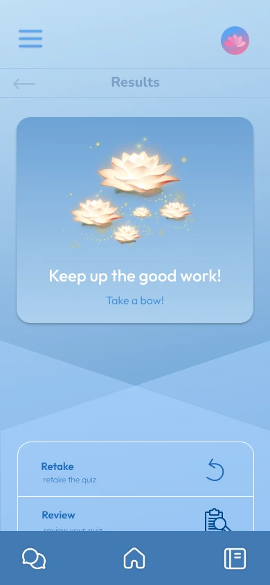
An illustration paired with a motivational response ("Keep up the good work! Take a bow!") maintains an encouraging experience and promotes progress instead of judgment.
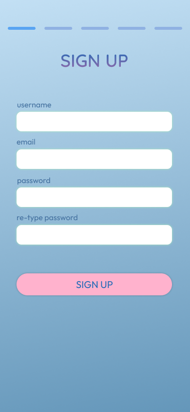
The final designs translate research and user feedback into a cohesive experience that feels approachable and relevant. Every detail was considered to support user comfort and long-term engagement.
Attention spans wane over time.
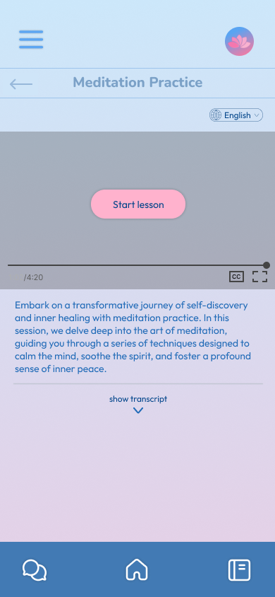
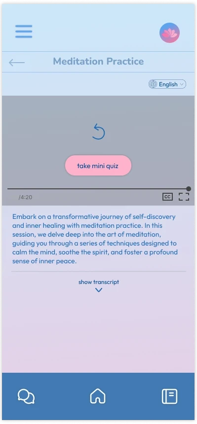
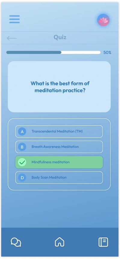
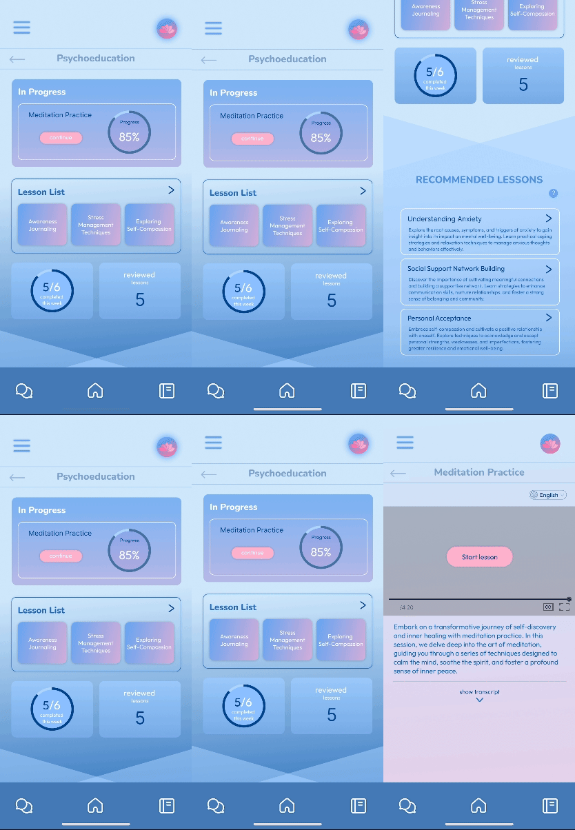
Therefore, we needed to make the most of user engagement time. Each lesson is composed of a ~3 minute informational video and a mini quiz. Lessons are kept short to prevent fatigue, and a quiz right after seals in the information the user just learned.
Being decisive can be overwhelming and tiring.
Ordering tasks by importance implicitly drives users to click the first button, since we want them to complete that task before navigating to the rest of the resources.
The Primacy Effect is a cognitive bias that results in a person remembering the first items in a sequence more effectively than those presented later.
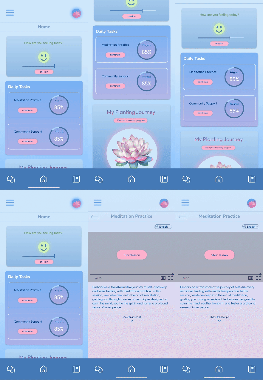
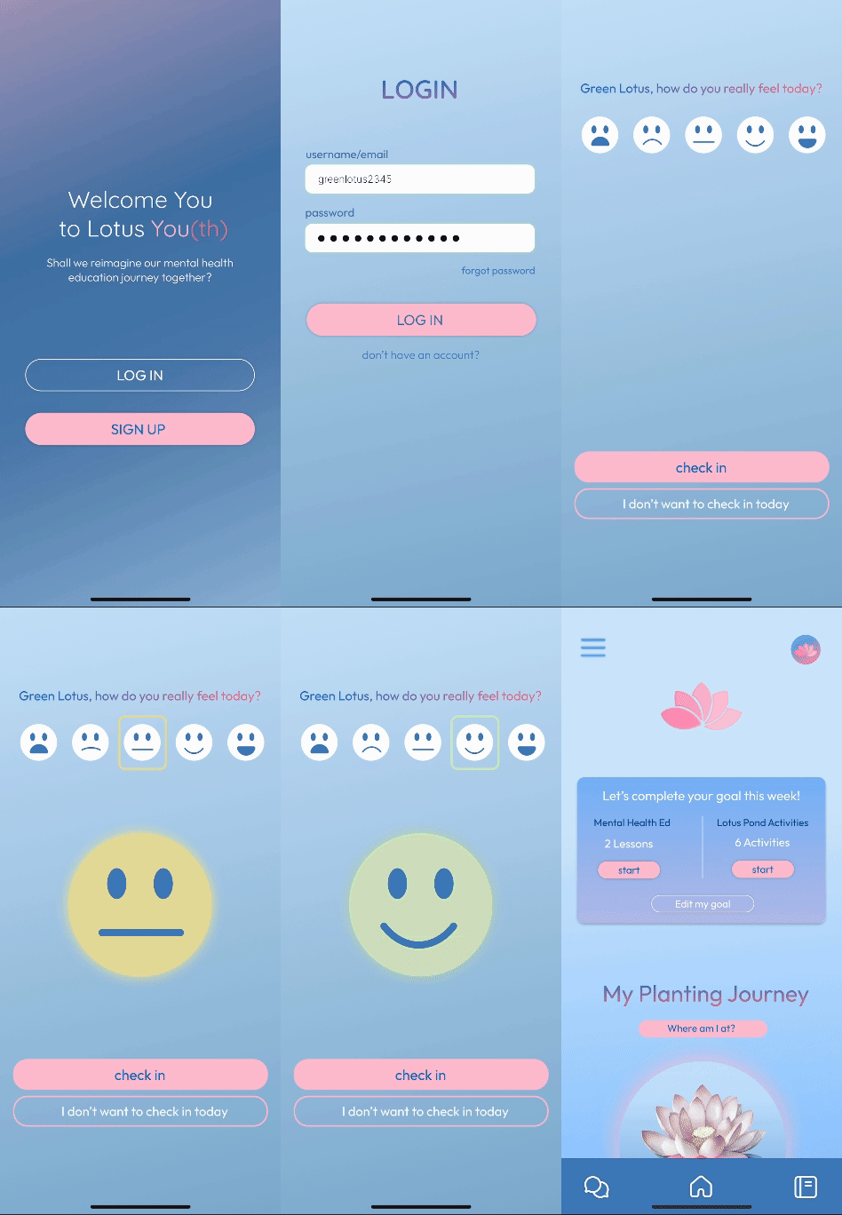
Without an understanding of emotions, identifying areas for improvement becomes difficult.
Incorporating an emotional check-in after logging in each day helps users clearly identify their current emotions and emotional changes through app usage, showing improvements in their mentality over time.
We generated 84% user interest from the 25 participants we tested. The remaining 16% liked the concept but had no interest in talking about mental health at all.
"This helped me understand my emotions and feel less alone when my family didn't get mental health."
Emma H., 19 Chinese American"I was taught stress meant success, but this app showed me it's okay to ask for help and care for my mental health."
David H., 20 Korean AmericanWorking in an early-stage startup taught me a lot about being lean and knowing when and where to focus my design energy. Given more resources, I'd add a metrics page so users can visualize their progress on their mental health journey, addressing the sense of stagnation that can otherwise make the healing process feel unrewarding.